FINAL POST : Art 4 Review
In this class I feel like I improved a lot on building off of my ideas and changing the compositions on certain pieces. I also learned how a composition changes a piece by altering the focal point and flow of it. I struggled a lot with this this year, mostly because I couldn't find exactly what I wanted to paint based on the guidelines. A perfect example of this is the VW Bus painting. I knew what I wanted to do but I struggled to fit the theme of "Interior Spaces". I had to do something where you could see the inside but make the composition more interesting, the resolution was making the collage of different bus angles. A valuable skill I learned was palette knife painting, I had no idea how to properly do it in the past but really like the style. This year I was able to achieve the palette knife painting in the pear and oil landscape. I feel like I learned how to manage my time and understand my style more. By being limited to certain topics I learned what I am good and need to improve on in my works. I understand that I am good at detail oriented and structure paintings, I can improve on painting people and faces. I struggled with the face and fruit painting and doing the proportions and keeping it realistic. I would prefer to have a more realistic style but may need to discover my own personal way to draw people. All in all I think I can improve more on trying different styles and painting people. Another things I would like to improve on is my planning process, I was good at it in Art 2 and would like to reorganize my sketchbook and refine my process. It's definitely something I need to work on for my AP art portfolio. All in all I am happy with my progress and exploring different mediums this semester.
In this class I feel like I improved a lot on building off of my ideas and changing the compositions on certain pieces. I also learned how a composition changes a piece by altering the focal point and flow of it. I struggled a lot with this this year, mostly because I couldn't find exactly what I wanted to paint based on the guidelines. A perfect example of this is the VW Bus painting. I knew what I wanted to do but I struggled to fit the theme of "Interior Spaces". I had to do something where you could see the inside but make the composition more interesting, the resolution was making the collage of different bus angles. A valuable skill I learned was palette knife painting, I had no idea how to properly do it in the past but really like the style. This year I was able to achieve the palette knife painting in the pear and oil landscape. I feel like I learned how to manage my time and understand my style more. By being limited to certain topics I learned what I am good and need to improve on in my works. I understand that I am good at detail oriented and structure paintings, I can improve on painting people and faces. I struggled with the face and fruit painting and doing the proportions and keeping it realistic. I would prefer to have a more realistic style but may need to discover my own personal way to draw people. All in all I think I can improve more on trying different styles and painting people. Another things I would like to improve on is my planning process, I was good at it in Art 2 and would like to reorganize my sketchbook and refine my process. It's definitely something I need to work on for my AP art portfolio. All in all I am happy with my progress and exploring different mediums this semester.
|
Oil Landscape
I was inspired to paint this since I wanted to try something different than just structures in landscapes. I really like cactus's so this was a way of me to paint them in the foreground. In the past I have struggled with pallet knife painting. I feel like i am more successful with it now. I focused a lot on contrasting and differing textures more than just the colors. I found it convenient to paint with the knife since there is less mess and I can alter the layers and texture. The most difficult part was the small details especially on the slopes where the land changed between each layer. My favorite part was mixing the oil and creating the sky. I found it difficult to work with the thicker oils even with liquin some colors didn't mix well and I had to figure out how to make them work together. I think overall I am happy with this painting, if there is one thing I would change, I would make the farther cactus in the foreground larger and taller. Ordinary Extraordinary
For this i based my painting off of another painting of a brass and string instrument dancing together in a city. I realized I would not have the time to do something so intricate, especially in oil as I had planned to do. Instead I chose acrylic and after testing out many types of dancing instruments picked only one. I chose to do a string/bow instrument dancing like a Spanish dancer with fabric. I wanted to show a lot of contrast in the textures and colors. The top is smooth an warmer while the bottom remains separated and cooler tones. The skin is almost separate from the instrument and is white contrasting the background. I added gold and symbols in the background to try and tie everything together, while also adding purple tones into the skin in the arms. I am unsure about the hands and fingers in this piece. I wanted to add a bow into her hand but was scared it would hide too much of the body or take away from it. I am not sure if I would change the shape of the fingers or keep them. Overall I think this was a very successful piece for me and is in a different style than I am used to. Interior Spaces
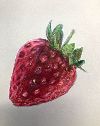
I started out with two ideas I really liked but no ideas for composition. I wanted to do a train but thought it wasn't much of a challenge and wouldn't involve as much color as i would have liked. Instead I took my second option and drew a few perspectives of it, so that the inside could be seen from different views. I painted this in oil just because I prefer that medium for creating textures. My favorite part is the far right angle of the bus because of the colors and details. I feel as though I picked a good variety of backgrounds almost making it similar to pop art but having gradient. I wasn't sure about the bottom middle view of the inside seat but ended up really liking the cushions and colors together. Overall I think the only thing I would change is the top left because I am not too happy with some of the details inside. I would change it by putting some more time into adding depth and textures. Prisma Color Fruit
The first time I have tried to draw with prisma colors in a while. I restarted twice because I could not figure out where to start and what colors to lay down first. The first time I started on the leaves and did not like the outcome. The better time I used white to outline everything and colored in the dark and lights. I built on top of this with browns, blues, and oranges, then used a light and dark red. All in all I am very happy with how I captured the texture and the darkness. I think there is a lot of depth in this drawing. Only think i would change is the layers on the leaves so they are just as waxy as the rest, but they have a soft fuzzy looking texture which I am fine with. Candy Apple
My reflections prisma color piece is of a Ferris wheel, sunset, and my hand holding a candy apple. I chose to draw this because I like sugary foods, so candy apple was the way to go. I also go to carowinds very often, as well as the state fair. The candy apple is purple because it is my favorite color. The hardest part of this was finding references for how to do the reflection in the apple. It was very difficult to find a photo, but I finally found a realistic candy apple with the reflection of a human shown on it. The other difficult part was finding the proper lay out for each subject in the drawing. After a few sketches i picked one with the Ferris wheel to the left of the apple in the foreground. I started with sketching each part and then slowly working on the hand. I used many colors to make my skin tone. I didn't build up many layers of pencil. I mostly started with darker colors and used a lighter shade to mix them. This made the paper very waxy and difficult to add highlights. It was important for me to save a lot of white space to make the lighter areas. Overall I am happy with the reflection as well as the piece as a whole. I feel like it was a good introduction to prisma colors and am happy with the realism of the outcome. |
|
|
Dramatic Dragon Fruit
I chose to use this photo for the self portrait because it has dramatic lighting and a unique face angle. It also has colorful fruit and makeup and I love to paint using bright colors. I started with the background and mixed grey/blue to make the gradient. Then I started with the eyes. The hardest part of the eyes was adding depth and constantly adjusting the slant in the right eye to make it smaller. Another struggle I faced was making the skin color and keeping it uniform throughout. I think i did a good job at making depth and darkness in the skin tone to ad face contours and the hands/neck. I really like how the fruit turned out because it is vibrant and looks fairly realistic, I like how the texture and colors pops out. I really like the hands, it took me a long time to find out how to do them and I ended up using a small brush to blend the colors. Instead of using the picture I used my own hands to make them longer than what is seen in the photo. As for drawing the most difficult part to draw was the nose because it always seemed to large, but was okay after colored and shaded. I am pretty proud of the ear because i had never painted or drawn ears before. All in all I like the outcome, one thing I would change is making the skin colors lighter and adjusting the eyes even more. I would also alter the lips and make the face shape slimmer. It might only seem so large because I stretched it for the canvas size. |
|
