Self Evaluation
1. Who was your referenced artist for the painting? Name 4 main ideas you used from your research to create your painting.
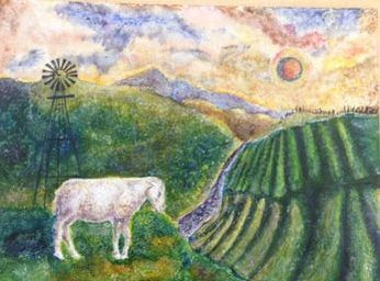
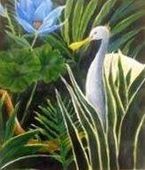
Name- William Blake
1. The color choice
2. Texture
3.Use of watercolors
4. Themes and shapes
2. Describe the craftsmanship of your painting. (Is it neat and well executed?)
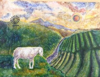
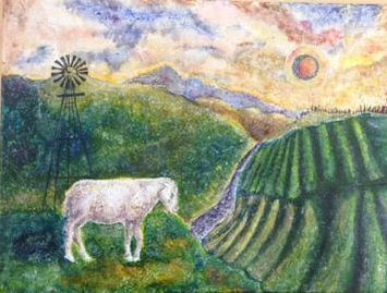
I think my painting is neat and well executed. There are no stray lines or blotches. I think everything turned out the way I wanted it to. I also never went outside the pencil marks in the painting. The thin lines and trees are straight and have no off strokes.
3. What was the most difficult part of this project?
The most difficult part of the project was creating the texture. William Blake etches and paints with watercolor. Using acrylic meant using a damaged/oil brush to dab on colors and create the grainy texture. Then after drying I used a watered down white to dab on top.
4. Describe your color choices and how they reflect the work of your chosen artist?
I looked at multiple works done by WIlliam Blake. The three main schemes are warm and dark, pastel greys, and warm blues. Looking at his landscape piece titled " Our Lady with Infant Jesus riding on lamb with saint John" I copied the colors of greens and blues because both landscapes contain a skyline above mountains and an animal.
5. Describe how the style of your landscape reflects your chosen artist.
The style of my landscape reflects the artist because like in the background of many of his paintings there are jagged figures. The mountains in my painting and similar to those existing in his. The lamb is a common animal to make an appearance in his paintings, and it shows up in mine. The sky in his paintings tends to be blotchy and feel of clouds with a surreal feel. In my painting I used a solar eclipse which is something that reminds me of Blake's paintings.
6. What do you think your chosen artist would say if he or she could see your painting today?
I think he would like my color choice and slightly criticize the look of the river. This is due to the way I couldn't recreate his water ripple effect. He might also comment on how opaque or dark my colors such as blues are because of his use of flowing watercolors onto the canvas.
7. What would you do differently if you were to do this project again?
If I was to do this project again I might make the sun a bit larger and change the position. I would also change the colors to pop of the the landscape, instead of blend with the skyline. I also would slightly alter the river so you could see the water running better. This would be done with more dark purples and blues.
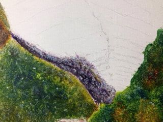
In progress river
|
(In progress) finishing adding texture/trees
|
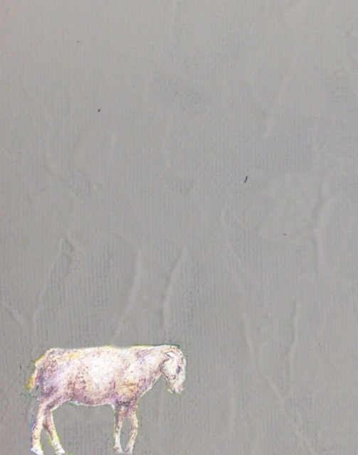
In progress lamb/sheep
|
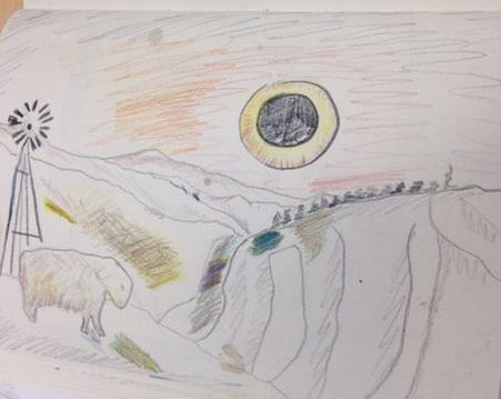
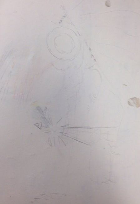
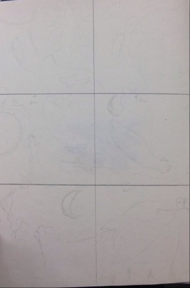
Final Sketch before painting
Draft sketch
|
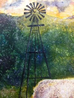
In progress just finished windmill
|
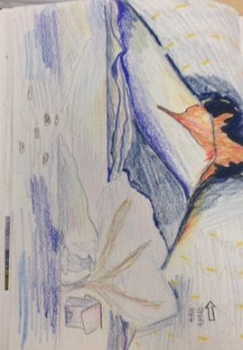
Another sketch
|
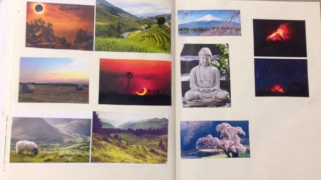
Reference photo page
|
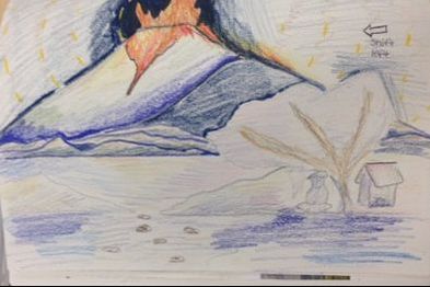
Sketch for Artist painting
|
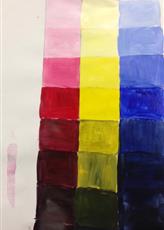
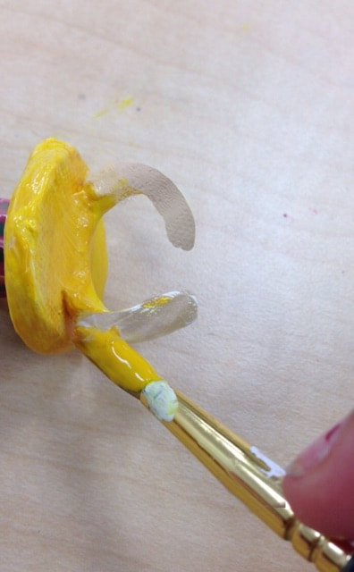
Color chart for acrylic paint showing shades and tints
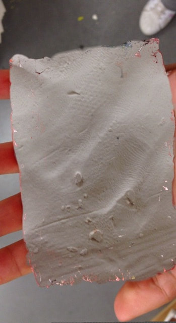
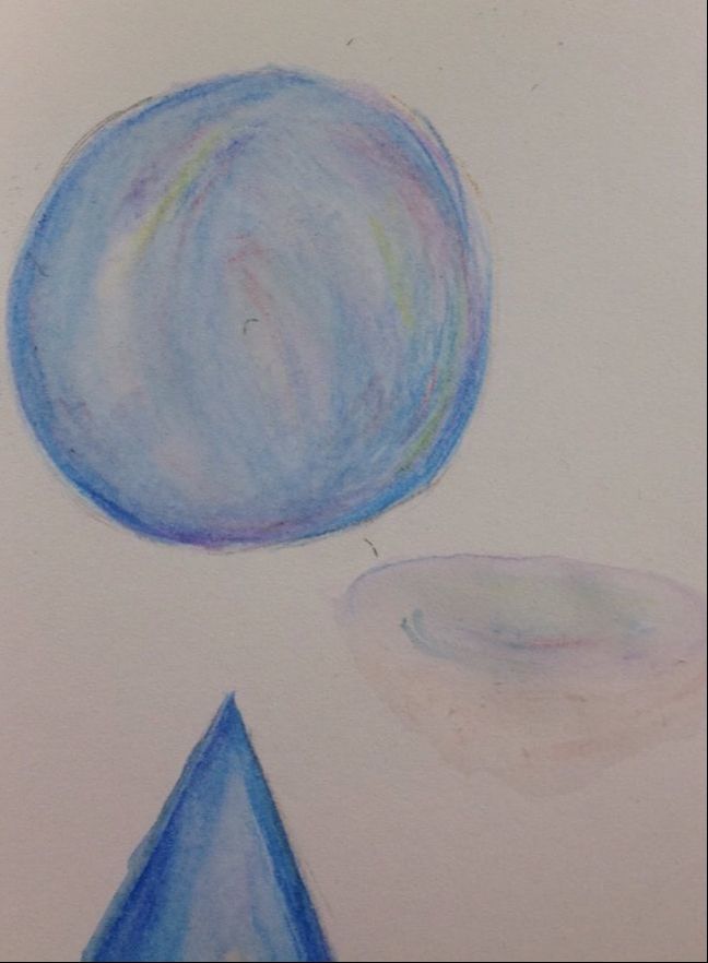
Recreation of acrylic piece unfinished
|
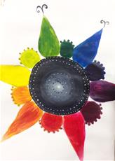
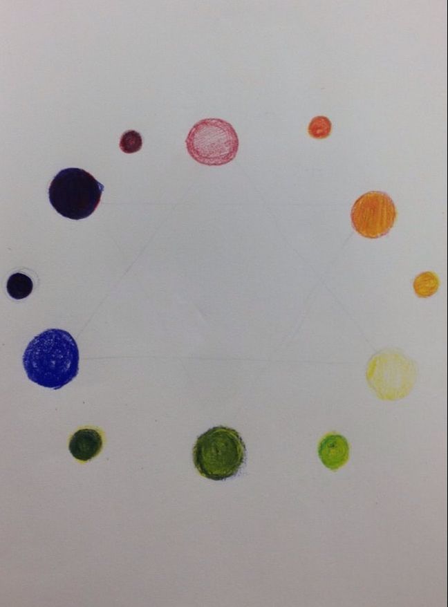
Acrylic color wheel
|
|
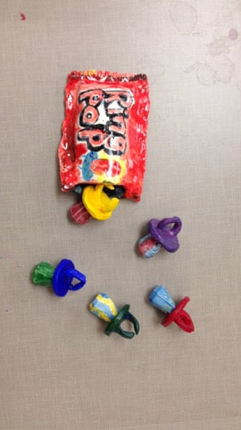
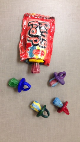
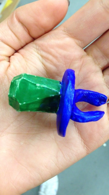
I think my piece is neat and well executed. The edges are all neat in my opinion and smooth and all the ring pops are close enough to being same shape and size. The only thing a bit off is some sides of the ring pop have small or even dips. The most difficult part of the project was being patient and waiting for each piece to dry a bit before shaping or attaching the clay. As well as creating the shape of the lollipop part of the ring pop. The small surface needed to have equal, smooth, and neat edges. Which was difficult on the small surface without ruining other sides that I had previously done.Did your color choices work together harmoniously? My sculpture is interesting from all views. I think that with all the colors the sculpture looks good from all angles and the bag and wrapper look good from different angles as well.
The differences in making the clay sculpture and a 2d piece is the focus on making sure that everything looks good from every angle and side. There is a need for each part to be painted. There are more difficulties for painting the surface and shaping everything instead of just painting or drawing. In my sculpture most of the sides needed to be smooth, so i hit the clay on the table (a smooth surface) to smooth and flatten the edges and used a q-tip to smooth out the ring. As for the bag I used a needle tool to create the sharp edges. Using glaze will create more smoothness and a glossy look which will add to the texture.My sculpture does look like ring pops. They are very recognizable on their own but the wrapper and bag add to the look. I think the color scheme, smoothness, and shape make them look very much like ring pops. I created the shape by making clay spheres, then squares, then using the table to hit the blocks on the table and shape them. After waiting for them to dry I slipped and scored to attach them to the rings. The rings were carved from slabs and smoothed with water and a small strip of clay was scored and slipped to attach to the top of the ring. The wrapper is made of 2 slabs. If I did this project again I would make some of the ring pops larger and start out with larger blocks. I would also make the ring parts about the same size.
|
making the pouch
|
In progress. Painting the broken ring
|
BRainstorming
|
In progress
|
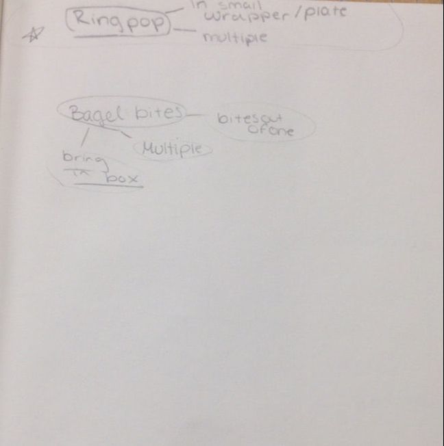
brainstorming
|
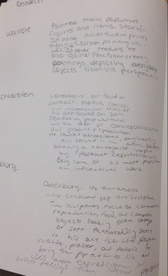
paragraphs about artists
pt.2 clay vocab
|
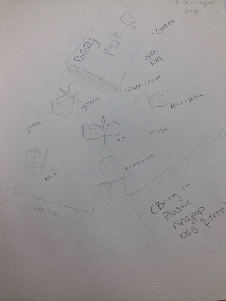
uncolored sketch for ring pop art project
|
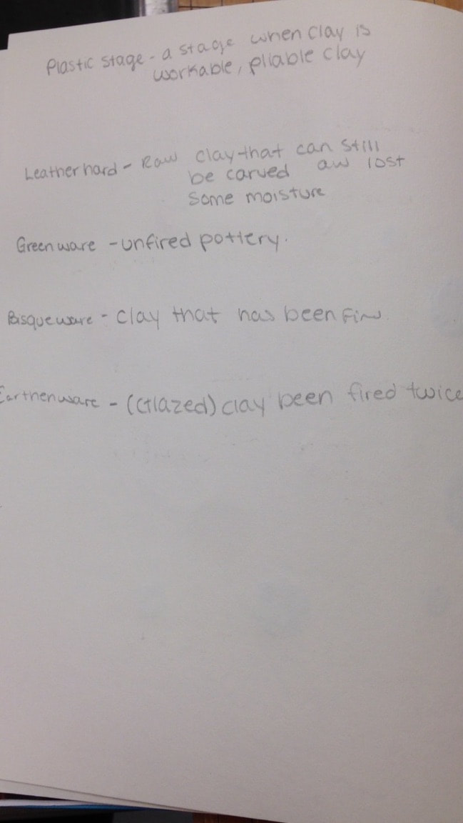
Clay vocabulary
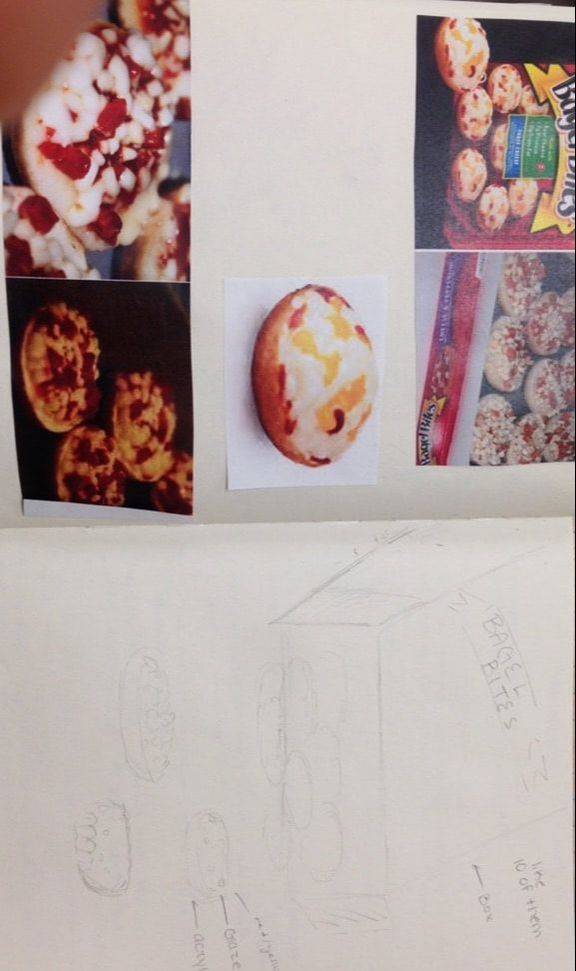
sketch for clay pop art
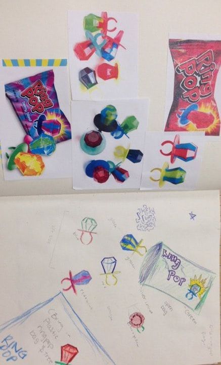
Colored sketch for clay pop art project
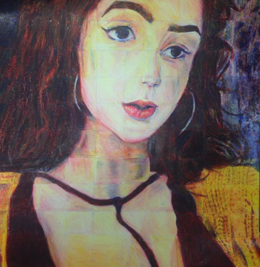
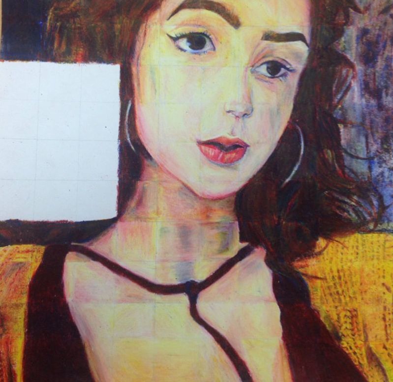
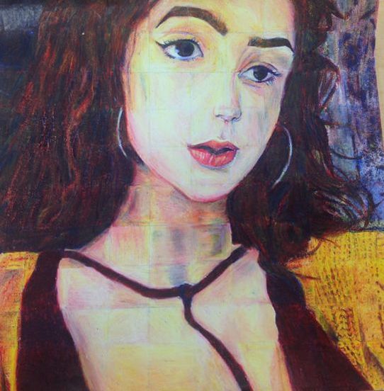
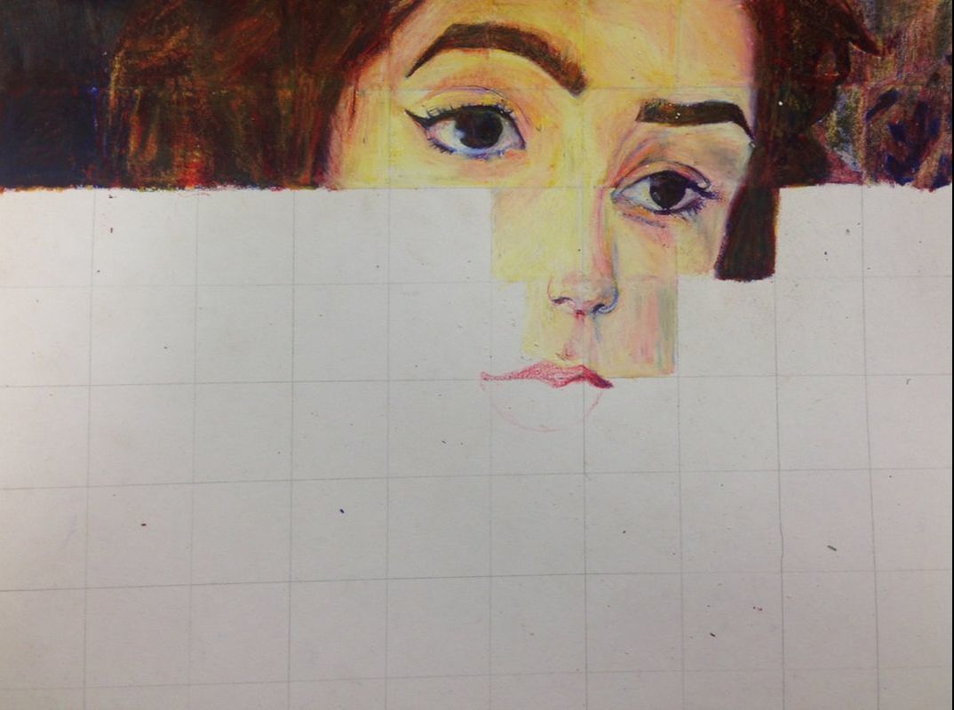
The outcome of the colored pencil portrait is well executed and neat in my opinion. It does not have very noticeable dark stray marks, especially on the skin where I was worried about getting smeared pencil marks. The colors are also close to accurate and not too many areas are far off. I had some difficulty in blending/mixing colors in the background, hair, and skin. It was hard to get a dark almost black wall in the background with not too many other red/ yellow tones. It was also hard to scratch out areas using the blender to show difference in lighting and wallpaper in the background. In the hair it was difficult to create hair texture especially after already creating many dark waxy layers on the paper. The skin was difficult because I needed many layers of white to scratch off and make lighter, and creating shadows to make dimension in the face was difficult without them looking like bruises. I did follow directions and draw this grid by grid. This is important because it helped me focus on only working on the color and mixing color and getting texture one square at a time. It would have been difficult using only three colors and trying to recreate colors and textures if I had an outline drawn and worked in larger sections. I created value changes by starting with light colors. I used many layers in areas like skin starting with light (yellow) and in dark areas like the background starting with a dark red or blue layer. I Also used the blender to make highlights where the light hits or used more yellows. I lightly used the blue or red for dark areas and shadows. The bleder was helpful in dragging out this colors and instead of leaving areas white allowing there to still be a wax layer on the paper with some of the surrounding colors. I think I got very close to the color I wanted with only three colored pencils. For the shirt and jacket I think I got the exact color. In the background on the other hand it was hard to reach black without looking blue. The hair also looks a bit more red and with many other tones showing through. As for the skin it was difficult to recreate the the tones. I needed a lot of blending and found it difficult to create a dimensional look. I could improve my portrait by changing the left eye and left wallpaper. I think the left wallpaper could look a bit less murky. I could have left more white and done less scratching with the blender. As well as working more on creating the vine pattern in the wallpaper. I could have adjusted the eye in it's square to line up more with the right eye and be closed to the same shape. I'm not sure how else to make it more obvious that my face was tilted in that angle in my portrait. I feel that I was successful in the project and this is due to how prepared I was. The coloring in of the cone and sphere were helpful. I learned how to mix colors very well and how to create highlights and starting with a darker color can be useful for me. The magazine cutout project helped me learn how to recreate patterns and textures specially when I redrew the bread and close up photo of the sweater. I feel as though Sakshi's piece is an excellent example of mastering the techniques. Her use of blending is very good and the colors are smooth and has very clean looking black for the hair. Her back round shows a variety of colors and shades which is amazing using only three colors. The skin color is very uniform ad looks tan without any stay marks or colors. The hair texture has lots of dimension and the highlights there and on the face are very well done.
In progress for primary color portrait color pencil
In Progress for primary color portrait
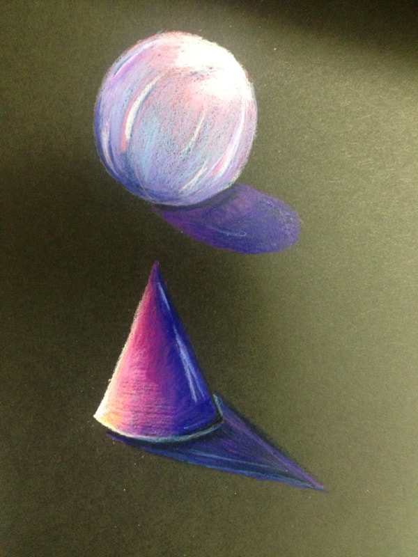
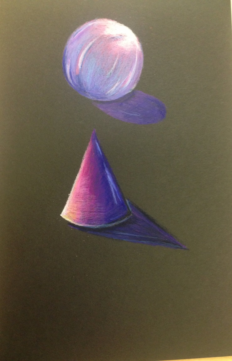
Color Pencil sphere and cone using layering of three colors in different directions to create shape
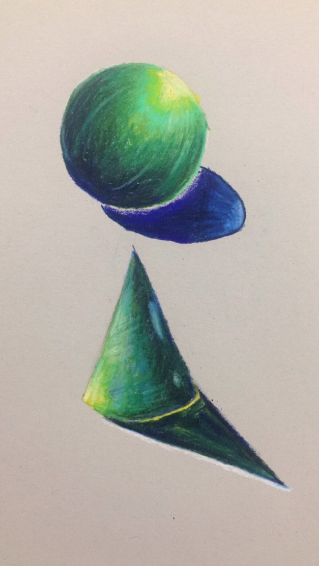
3 color pencil cone and sphere shading on white paper
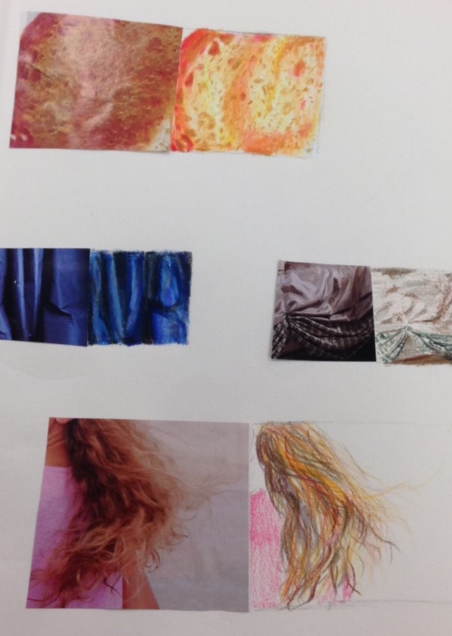
Textures, layering, and blending colored pencil from magazine photos.
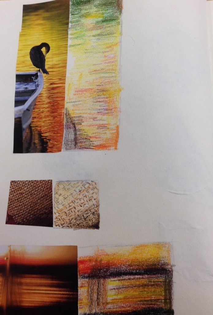
Textures, layering, and blending colored pencil from magazine photos.
Practice iwth watercolor pencils
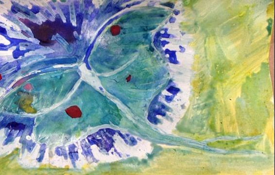
In progress Luna moth. Still has masking fluid.
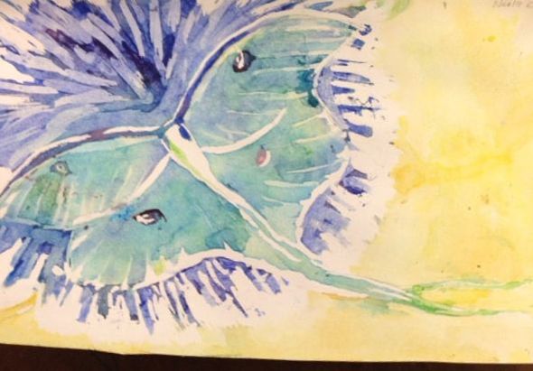
Finished luna moth. No longer has masking fluid.
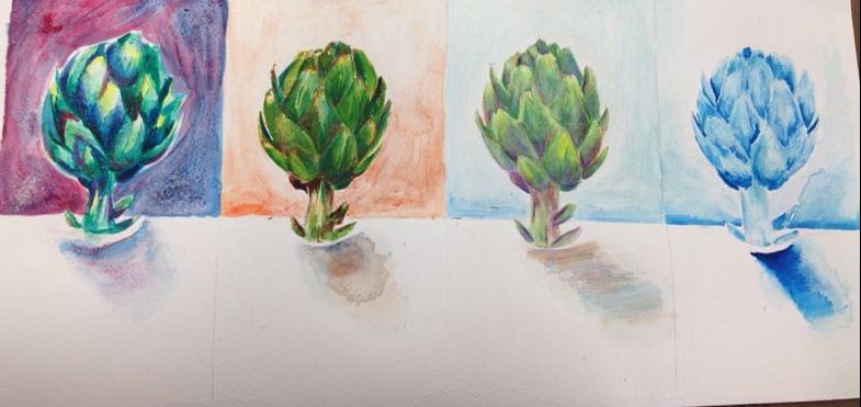
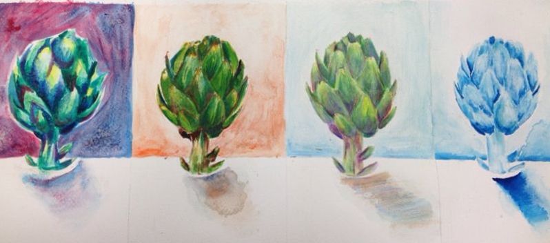
The warm color, one shade, cool color and salt, andd watercolor pencil artichokes finished.
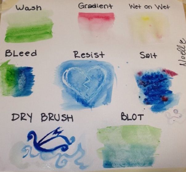
Practice learning different watercolor painting techniques
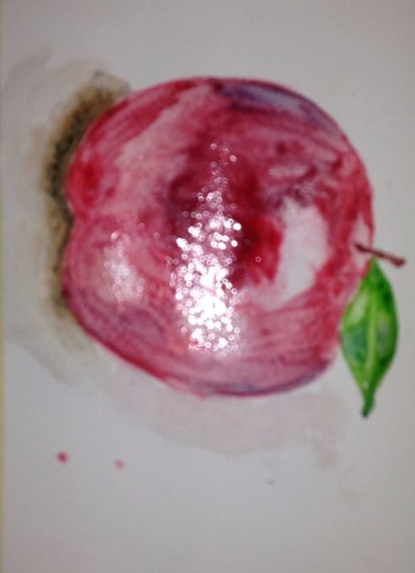
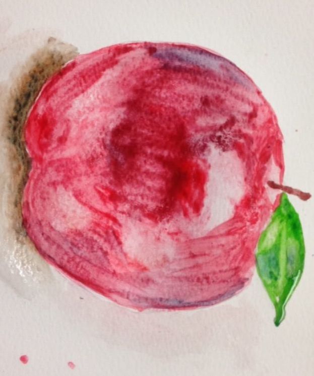
Using wash and gradient to watercolor paint an apple to show value and light
|
|
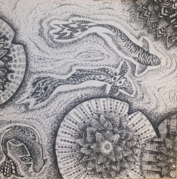
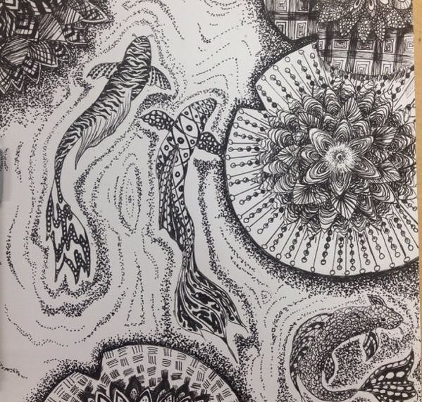
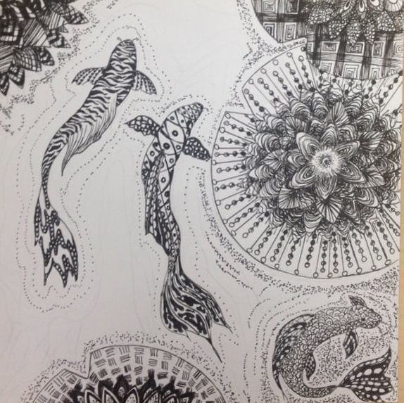
Pen and Ink / Patterning (FINAL)
SELF EVALUATION
1. Describe how you arranged your composition. Discuss your use of the elements and principles. Is it a successful composition?
I arranged my composition to avoid having a lotus in the middle. I made the flowers more spread out so that some go out of the page. The fish were drawn to swim in different directions and vary on size. I think the compositions is successful, this is because you can see the variation in the patterns and how they contrast and cause a distinction between shapes. The objects all make the viewer to look around the ink drawing instead of drawing attention to only one point. I think the depth is also well shown with values in the flowers.
2. How is texture and pattern are important in your composition?
Texture and pattern are important in my composition to show a distinction between different objects and their direction. The water pattern needed to differ from the fish and lotuses, so that it isn’t hard to tell the two apart. The texture also shows which way the petals and fish are turned/moving.
3. Why is value so important in this project?
Value is important in this project because showing the value creates a more realistic three-dimensional looking piece. The changes in value also make patterns blend together less in areas such as the fish and its fins. The value also adds a round shape to the fish and showing layers and shadows under petals and lilly-pads.
4. Describe your craftsmanship (How well the project is crafted technically).
I think the craftmanship is quite well done. In the piece, the stippling is all about similar dots/ details with very few having tails. The patterns have very few mistakes in them and do not look very rushed and the lines are clean. The only thing I think looks less neat is how the corn lotus’s patterns are too dark and not as accurate/too crammed.
5. Explain how your knowledge and creating practice studies with value and pattern contributed to the success of your piece.
The knowledge and practice with pen and ink patterns gave me many choices of different patterns to incorporate in the project. I also had an idea of what pen to use where and how to add smaller details to patterns to add value. I also practiced making my stippling more precise and controlled, as well as what patterns are contrasting and look nice together.
6. When applying the pen and ink/pattern techniques why and how is it important to make sure you understand the concepts taught in class?
It is important to know how to create patterns that wrap around objects. It is important because it creates a more realistic and less flat look to drawings. We also learned about motifs which helps us have controlled and varying patterns in art. Composition is important in creating an engaging art piece that doesn’t have a main center point or nonrealistic patterns ( always symmetrical, in same type throughout page).
7. As a growing artist, how do you think what you have learned will guide and better your future projects. Explain.
From this unit, I learned about having a variety of placement options to have a better outcome on my art. I also learned how to add small details and add value to art. This can help me in pencil, ink, and painting. I also memorized many patterns that complement each other and create contrasts.
8. If you could recreate your piece what would you do differently to enhance your final outcome?
If I recreated my piece I would probably add a different pattern to my fish swimming in a circle. I think it is too much like the water and differs too greatly from the other fish. I would also make the same fish’s tail a bit larger. One other thing I would change is the corner lotus’s petal patterns. I would create more value by adding lighter more varied patterns.
Final Touches added to create more depth in the texture, for example under the lilly-pads, and around the flowers.
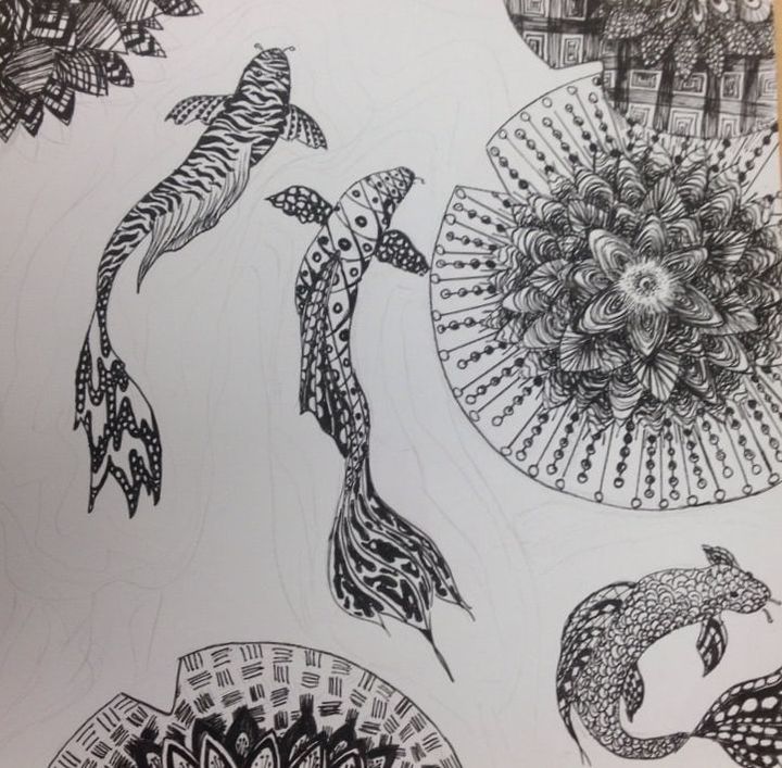
Fish with lilly pads starting to fill in textures with pen
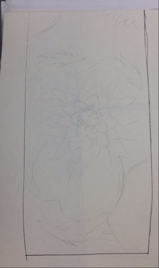
A planning sketch of my fish and lotus flower
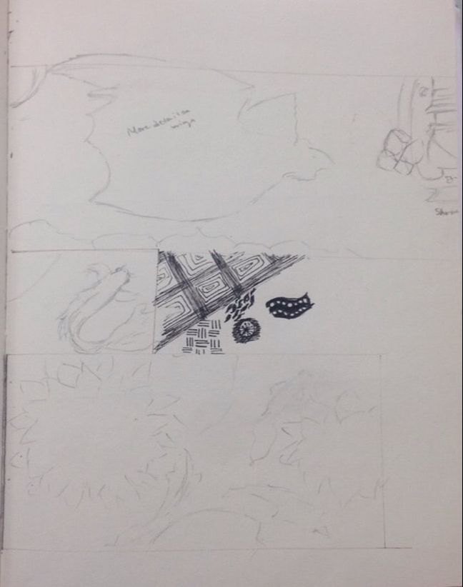
Planning sketch of my two ideas (lotus and bat) and of patterns used in each.
6 more drafts testing different placement of the fish and lotus
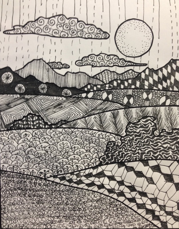
Pattern Landscape using patterns from 100 pattern squares. Different areas show different value and textures
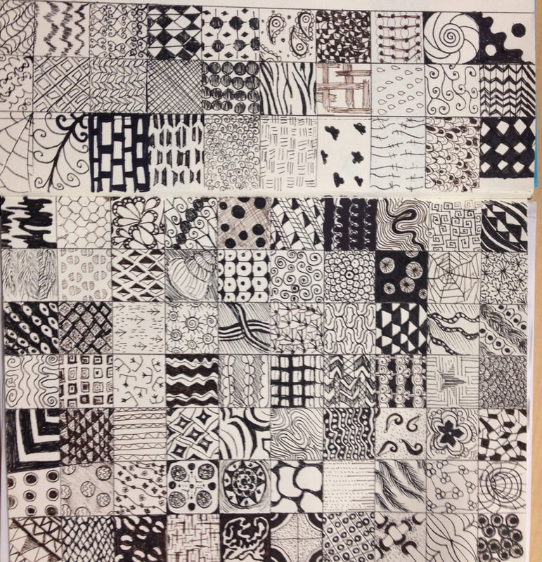
100 pattern square chart. I used many textures and values to show difference in the squares.
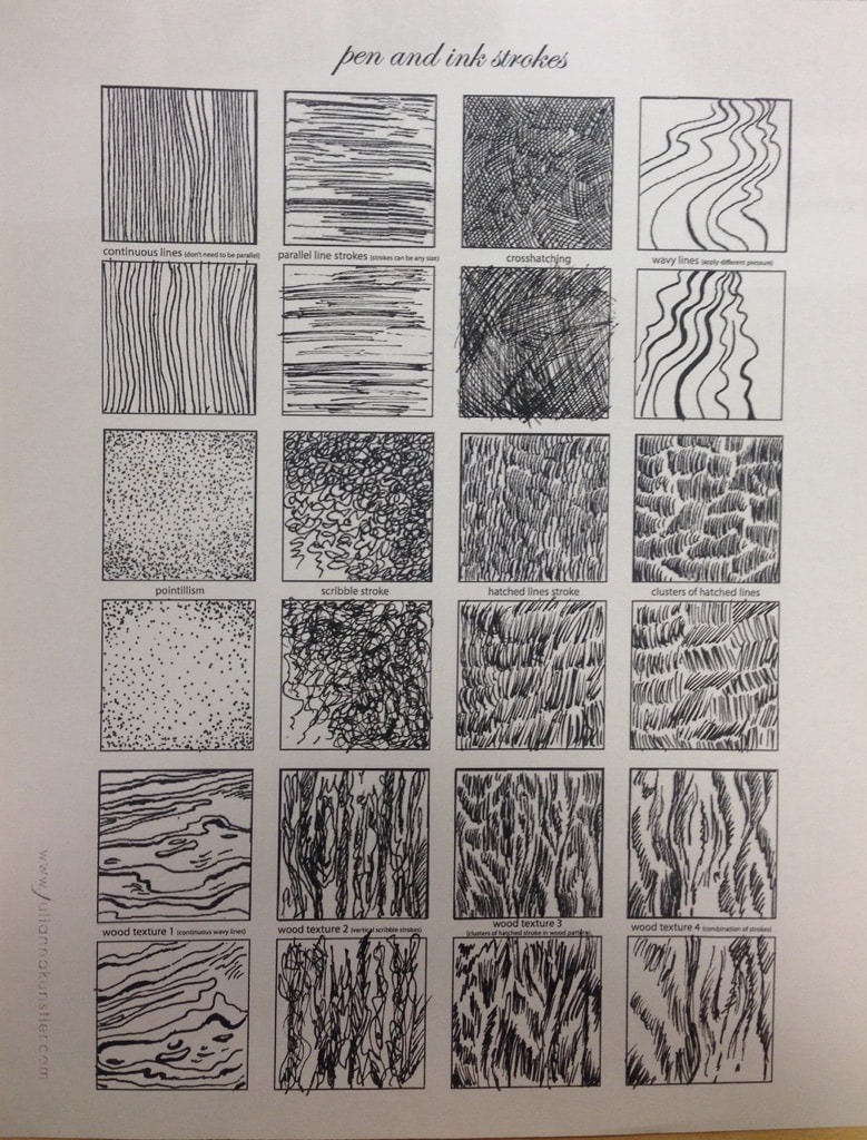
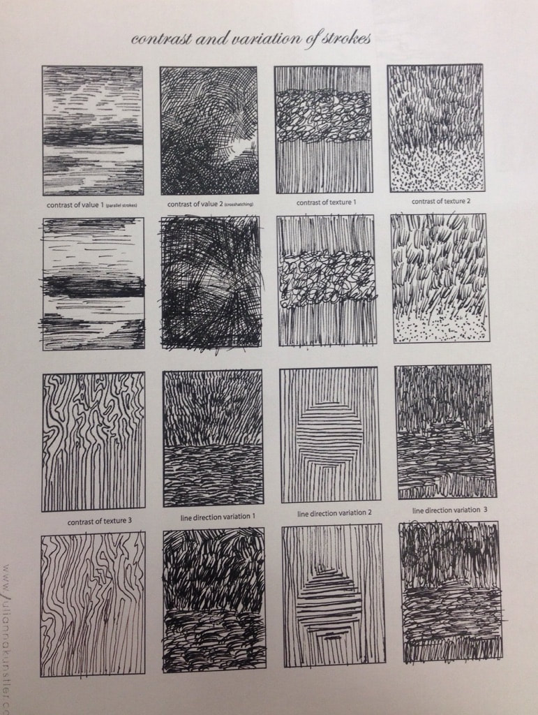
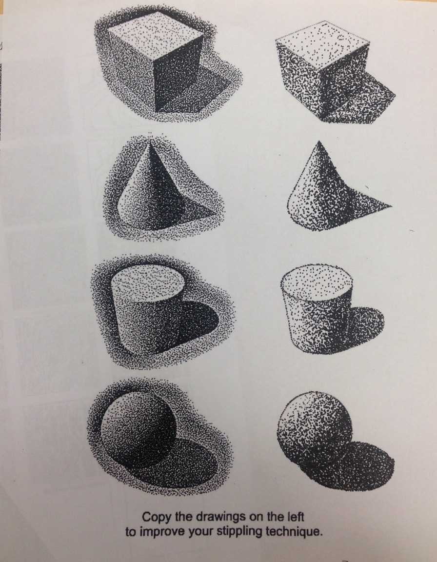
Stippling Worksheet
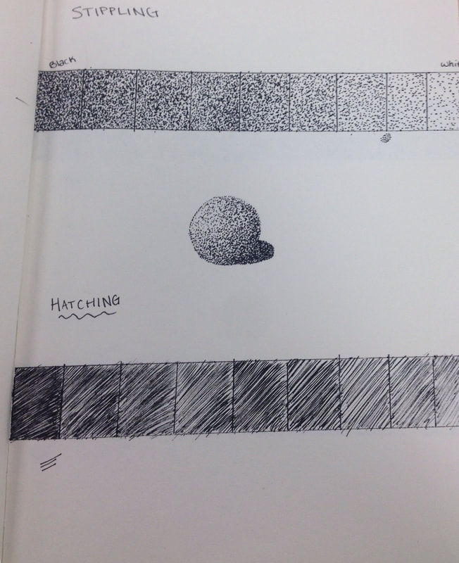
Pen and Ink Unit Hatching and Stippling value chart
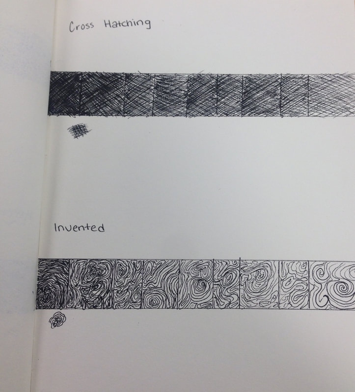
The Pen and Ink unit Invented and Cross Hatching value chart
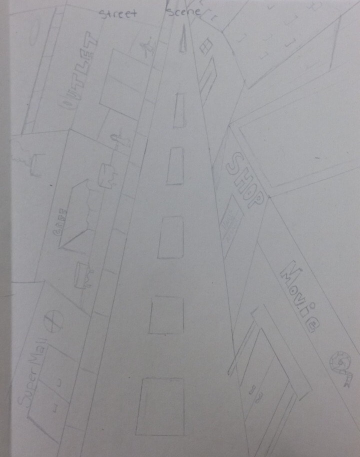
First point perspective drawing of street scene. I used the ruler to draw straight lines and started with the street. This angle creates the look of distance. Using the same angles along the buildings creates the look of looking ahead at a street. Changing the angles to create height in buildings was difficult, but I think I was somewhat successful also in creating the look of doors and buildings along the street.
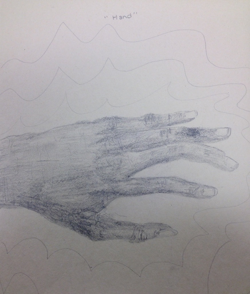
I struggled with making the hand. At first I tried to make a turkey hand which looked too basic, instead I drew my own hand in this position. I used shading to make shadows to make it look as natural as possibly. The lines in my hand were done with a really sharp pencil and it was difficult to make them dark enough to distinguish without them looking too unnatural compared to the shading of the rest of the hand.
|
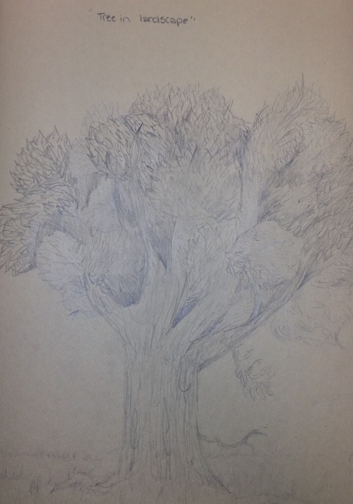
I used different pencils to create the look of leaves on this tree. I started out with different bunches and decided where the branches would be. After all the leaves i shaded darker areas and places to hep distinguish the bunches and the bark. I used a lighter pencil to make the bark design to look like it has texture. I also drew the grass to have bunches and some texture.
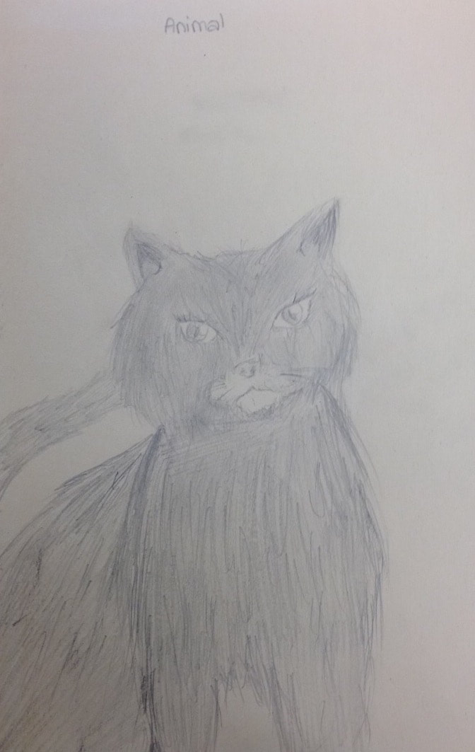
I started with the outside figure of the cat with a light pencil and started to add tufts of fur to the body. Using strokes in different direction helped achieve a fur texture to make a fluffy cat. On the face I tried to make the look of a contour with fur moving in different directions. Overall, I think this is my least favorite drawing, because the head shape looks deformed.
|
